Telecommunications History Group Resources
931 14th St. Historic Building
The Drawing Board - Architecture & Construction
Where to start on a Bell System palace? The Denver building was to follow the designs, generally, of the other Bell buildings built in the 1920s—New York’s, Cleveland’s, St. Louis’s, San Francisco’s, Newark’s, and Montreal’s. These were built as products of their times, in the American perpendicular style, and to fit the rule in many large US cities that a building over a certain height had to have its upper floors set back from the street so as to let light and air through to the street below.
The architects of all of these buildings (and the phone company itself) made utility a large factor of the design, but this was followed closely by beauty—beauty of line, of form, of detail, of mass, of setting, of color—of both exterior and interior. The idea that a building should fit all these ideals was an outgrowth of the new prosperity and leisure of the roaring 1920s in the United States, when economic good times seemed on a limitless rise.
The Bell palaces mirrored the values important to the Bell system companies: not only utility and beauty, but also appropriateness, modernity, and forethought. The buildings were to be tangible evidence of the thought, effort, and care that were involved in furnishing the best possible phone service.
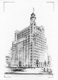
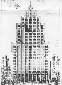
As the architects of the Denver building, Colorado’s W.N. Bowman Company sought a style that would encompass these values, and they came up with at least three ideas for the design of the building. One was more a massive clocktower design than was eventually used. Another was a sort of hybrid of the clocktower and the other Bell palaces (see images to the right).
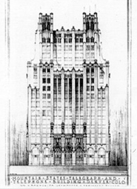
The eventual choice made by Mountain States Telephone was, however, very similar to all the other Bell palaces. The building follows perpendicular lines that lead the eyes upward, unchecked by horizontal interruptions except at discrete intervals. Succeeding tiers of stories are set back (see the bottom image), leaving terraces that give the effect of a step-sided pyramid surmounted by a lofty central tower. Gothic turrets accent the central tower, and the overall effect is magnificent. While impressive (and inspiring!), the design has practical value as well, admitting abundant light and creating an airy feeling throughout (and letting in air, too; the many windows could be opened to let in the breezes).
Of course, designing the building was one thing; building it was quite another.
The slideshow above, right: Three designs for the telephone building: a clocktower, a hybrid, and the eventual design. (THG archives).


